
SP—099 / Health & wellbeing · Packaging direction
CARE DESK
A creative direction for a patient-service communication concept.
Concept projectAn independent creative concept for a fictional brand, not commissioned client work.
The hypothetical brief
Develop CARE DESK, a fictional concept for a patient-service communication concept. Intimidating language and sweeping promises can make a first step feel harder. The assignment is to make the proposition distinctive across a campaign poster, a social composition, a motion storyboard and a contextual application.
Who it’s for
People seeking a welcoming, understandable route into a wellbeing service.
The strategic idea
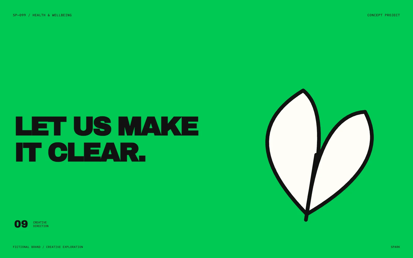
“LET US MAKE IT CLEAR.” is the central creative thought. Explore how a graphic signature travels from a large campaign canvas to the smaller scale of a branded object. Lead with an accessible invitation, explain the experience, and avoid unsupported health or transformation claims.
The creative direction
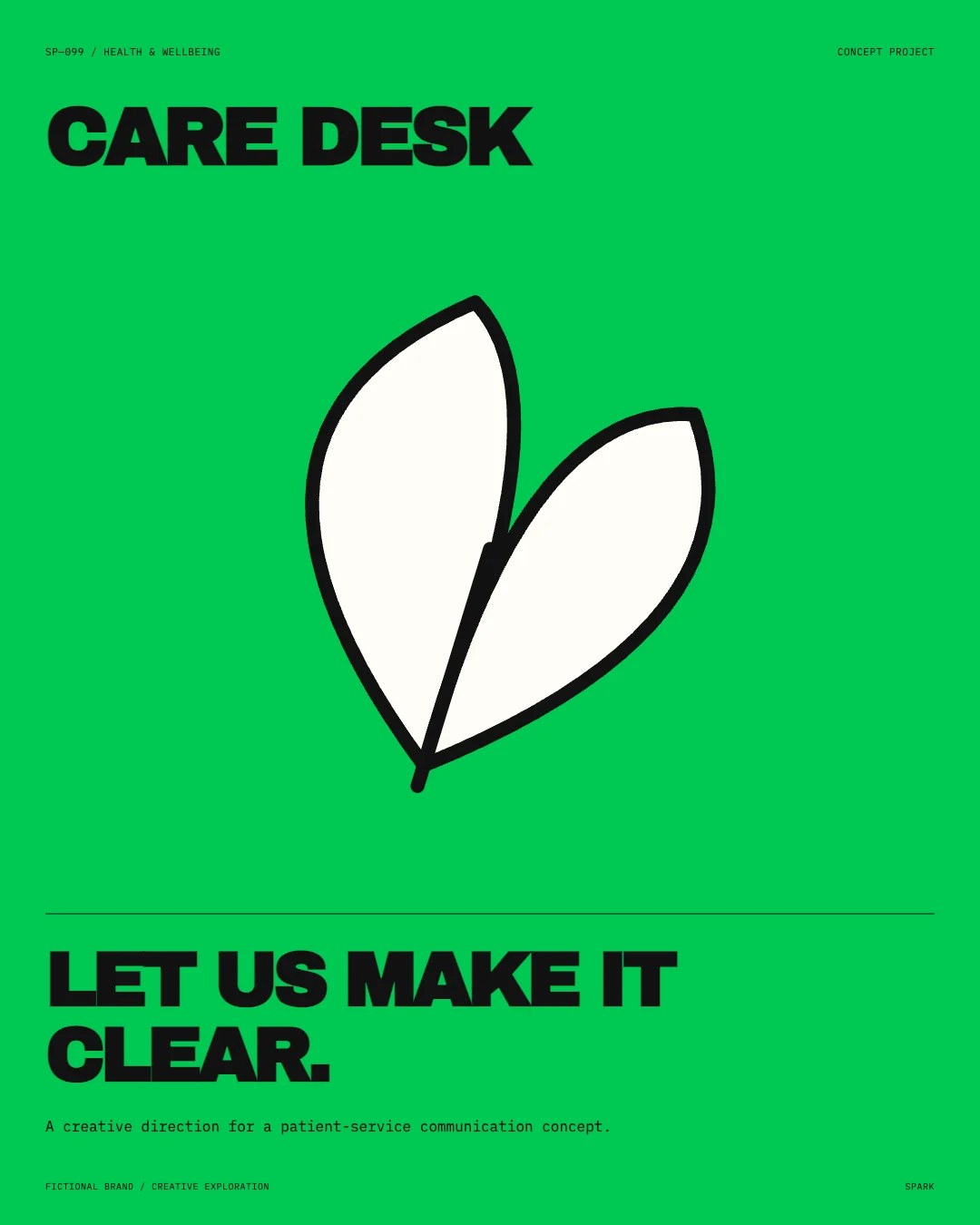
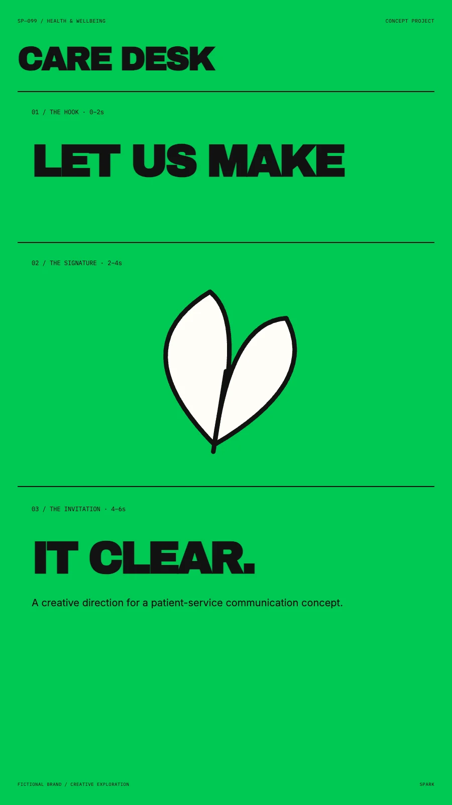
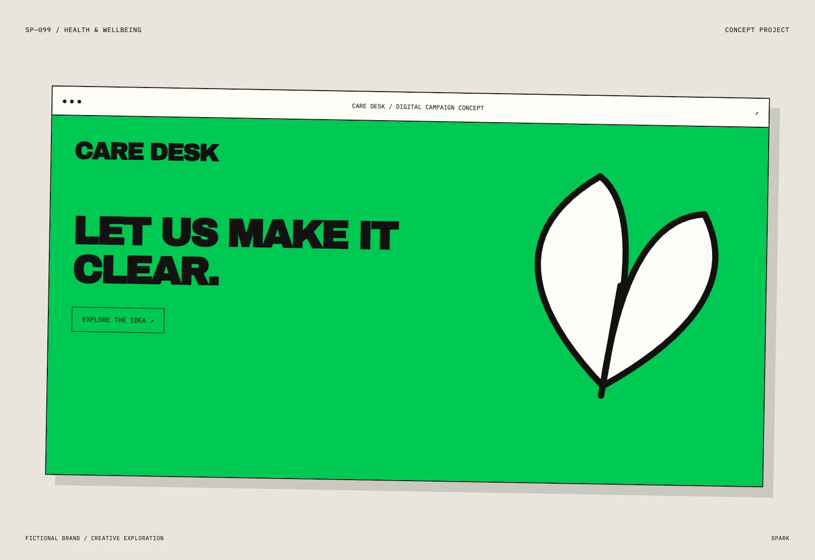
An original leaf-inspired graphic, assertive typography and a #00C853 colour field create the visual language for CARE DESK. The four compositions change scale, pacing and framing while retaining the same signature.
This exploration demonstrates creative thinking and craft. It has not run as a live campaign, so no commercial results are claimed.
YOUR BRAND.
A FRESH ANGLE.
Let’s build something grounded in your audience, your offer and your next move.
Talk about your project